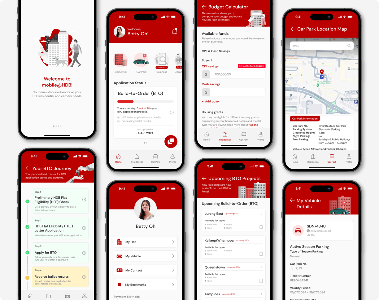
The Mobile@HDB app redesign is a strategic initiative aimed at significantly enhancing the digital experience for users interacting with Housing and Development Board (HDB) services.
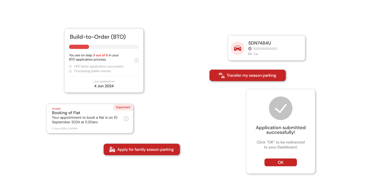
HDB’s digital experience is centred around its efforts to enhance resident interactions and streamline services through technology. This includes a comprehensive range of online services and mobile applications that cater to various needs, from transactional services like application for flats and payment of loans to informational services providing details about housing policies and regulations.
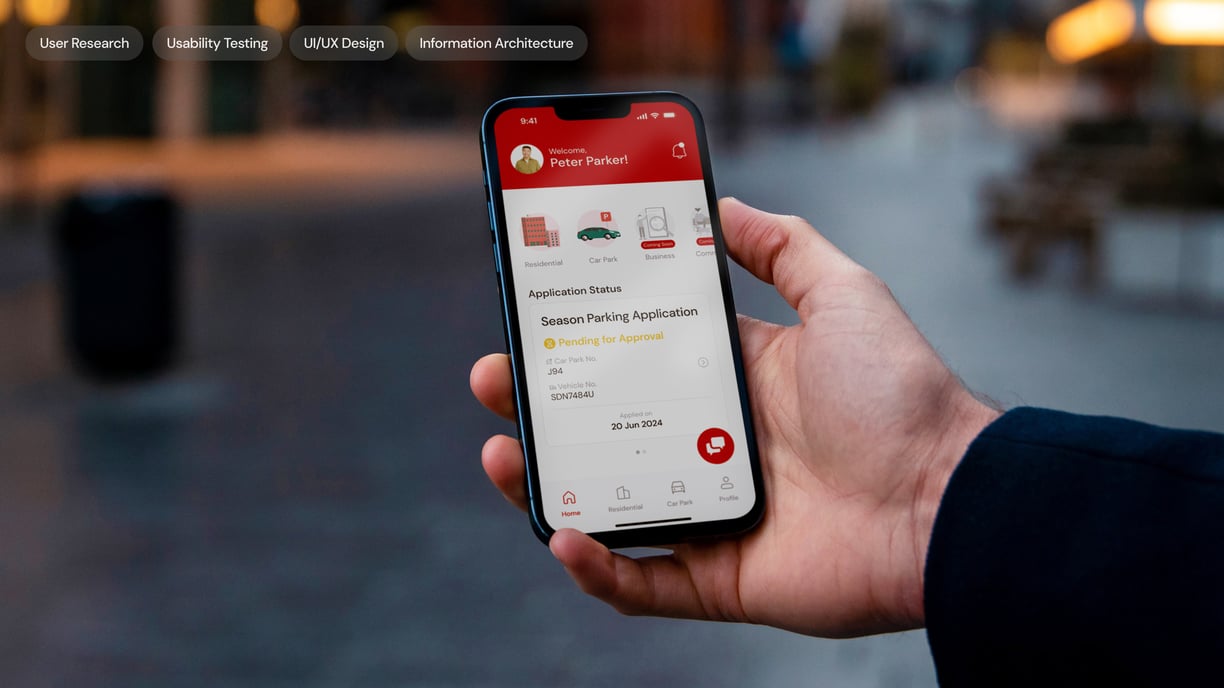
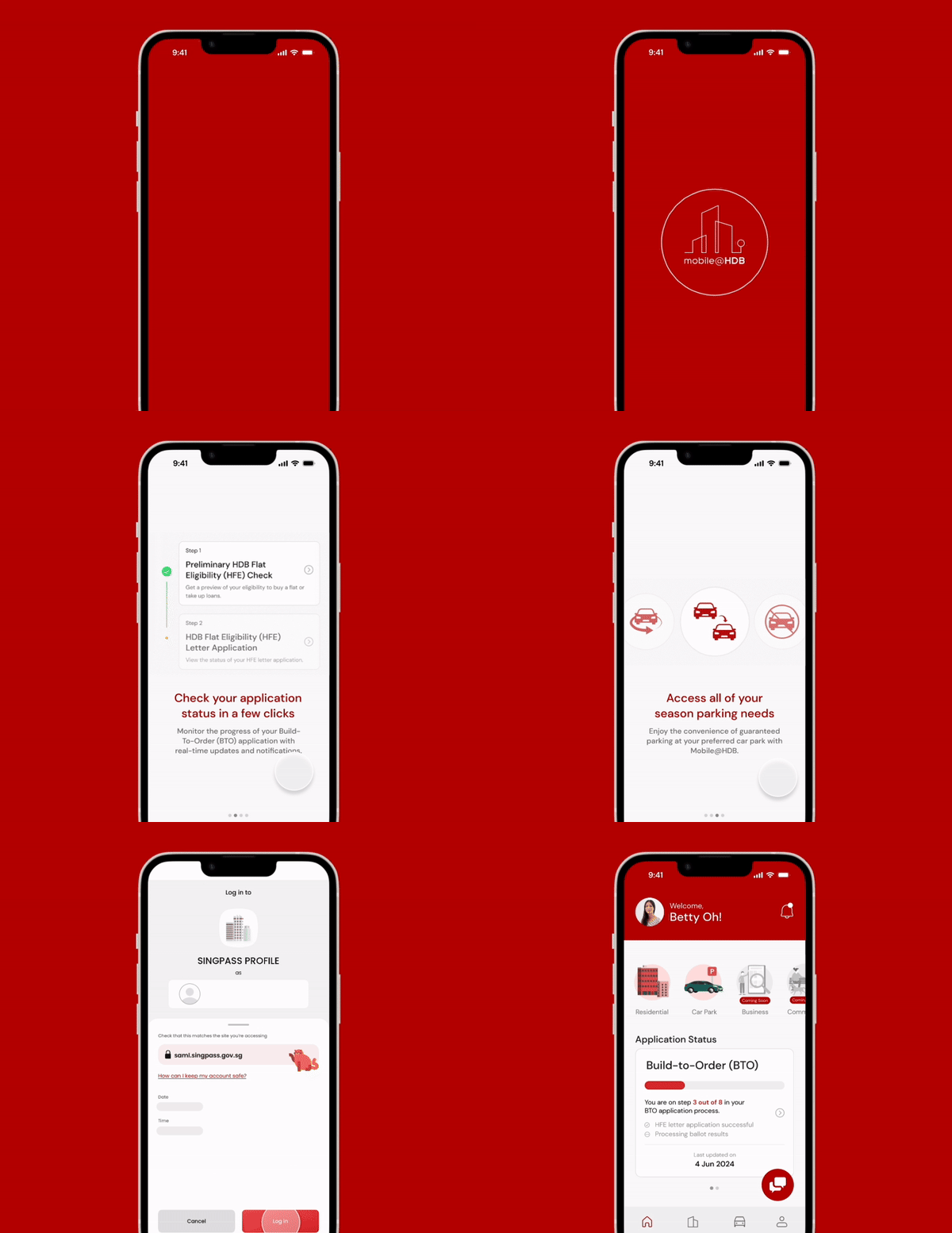
The goal of the Mobile@HDB app redesign is to improve user experience by making the platform intuitive, user-friendly, and efficient. We began with user research to identify pain points and gather feedback on housing and parking services. Based on this, we streamlined navigation, improved accessibility, integrated advanced features, and ensured seamless interaction.
We then created a prototype focused on simplifying the information architecture and key functionalities, which was rigorously tested to validate its effectiveness.
GOAL

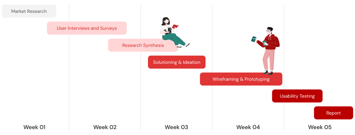
SCOPE OF WORK & TIMELINE


MARKET ANALYSIS
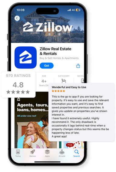
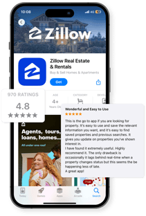
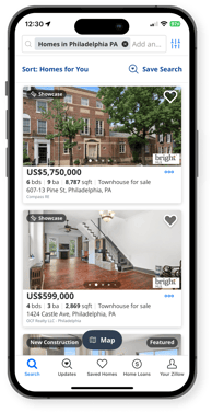
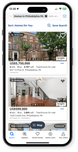
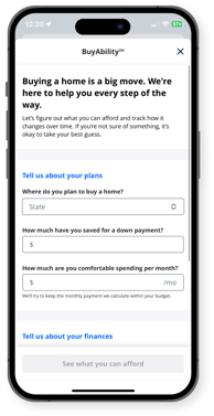
We also conducted a comparative analysis with Zillow, an American real estate platform that is very well-loved. Looking into platforms like Zillow provided valuable insights into industry standards and user expectations at a global level. By examining their strengths and weaknesses, we were able to identify key features and design elements that could enhance the Mobile@HDB app.
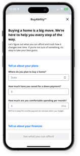
While Mobile@HDB benefits from high trust due to government backing, it falls short in user experience compared to private sectors like 99.co and PropertyGuru in Singapore. These apps excel in intuitive design and ease of navigation, setting high standards that the users now expect.
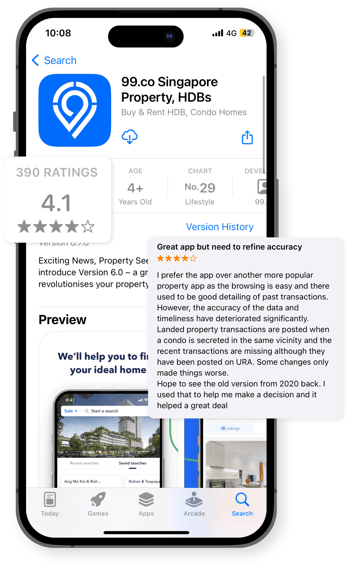
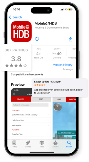
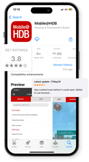
The team conducted a comprehensive market analysis, comparing the Mobile@HDB app against 99.co and Zillow. This evaluation covered user interface, functionality, engagement, and feedback to assess our app's market position and identify improvement opportunities.
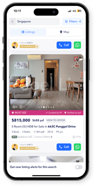


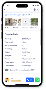
99.co
Mobile@HDB

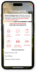
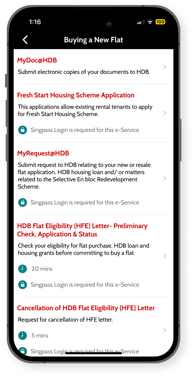
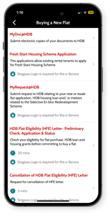
This app allows users to access a range of HDB’s services on the go. Key features include transactional services like flat applications and payments, as well as informational services such as details on available Build-To-Order (BTO) flats, transacted prices, and directions to HDB service centres.
Core functionalities
Broad real estate functionalities with a focus on efficient property search and transaction tools
Ease of navigation
Intuitive and easy to navigate
Information finding
Information is well-organised and easy to find
Interface design
Clean and organised layout with some visual appeal
Core functionalities
Provides comprehensive info, facilitates applications, and enables transactions for housing, business, community, and car park services
Ease of navigation
The in-app browser is cluttered, and key features require multiple clicks to access from the home page
Information finding
Challenging due to excessive information spread across different pages and requiring multiple clicks to access
Interface design
Cluttered layout; functional browser needing modern improvements
Core functionalities
Real estate listings, pricing estimates, mortgage calculations, and neighbourhood information
Ease of navigation
Easy to navigate with useful tools and search filters, and clear content layout
Information finding
Easy to access property listings, with robust filters and tools to search for properties. Property information is well-structured
Interface design
Sleek and modern, designed for quick browsing and interactive property viewing
Zillow
USER RESEARCH
Key insights
The team conducted user interviews with 38 participants who have interacted with the HDB website or Mobile@HDB app within the last three years. All participants were between 18 to 44 years old, targeting the demographic most likely to engage in purchasing HDB public housing flats.
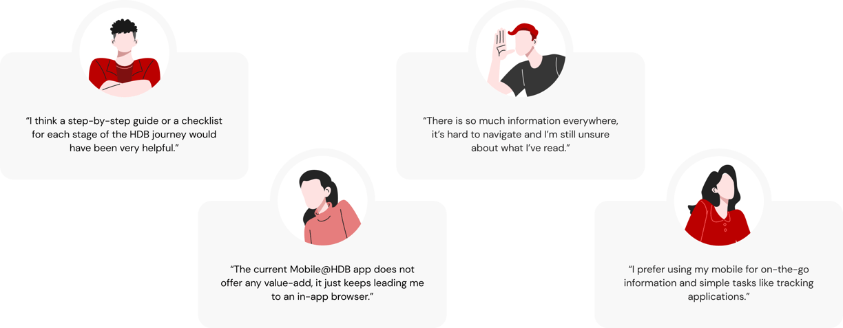


What our users had to say
USER PERSONAS
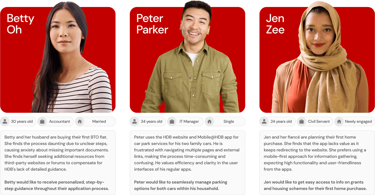
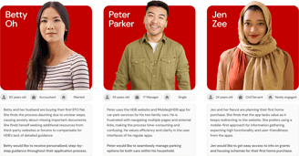
The team analyzed user interview data to create detailed personas for the Mobile@HDB app redesign, representing distinct user segments such as BTO applicants, season parking users, and prospective homebuyers. Each persona highlights unique needs and challenges, with accompanying problem statements, "How Might We" questions, and solution statements to guide design decisions and improve user experience.
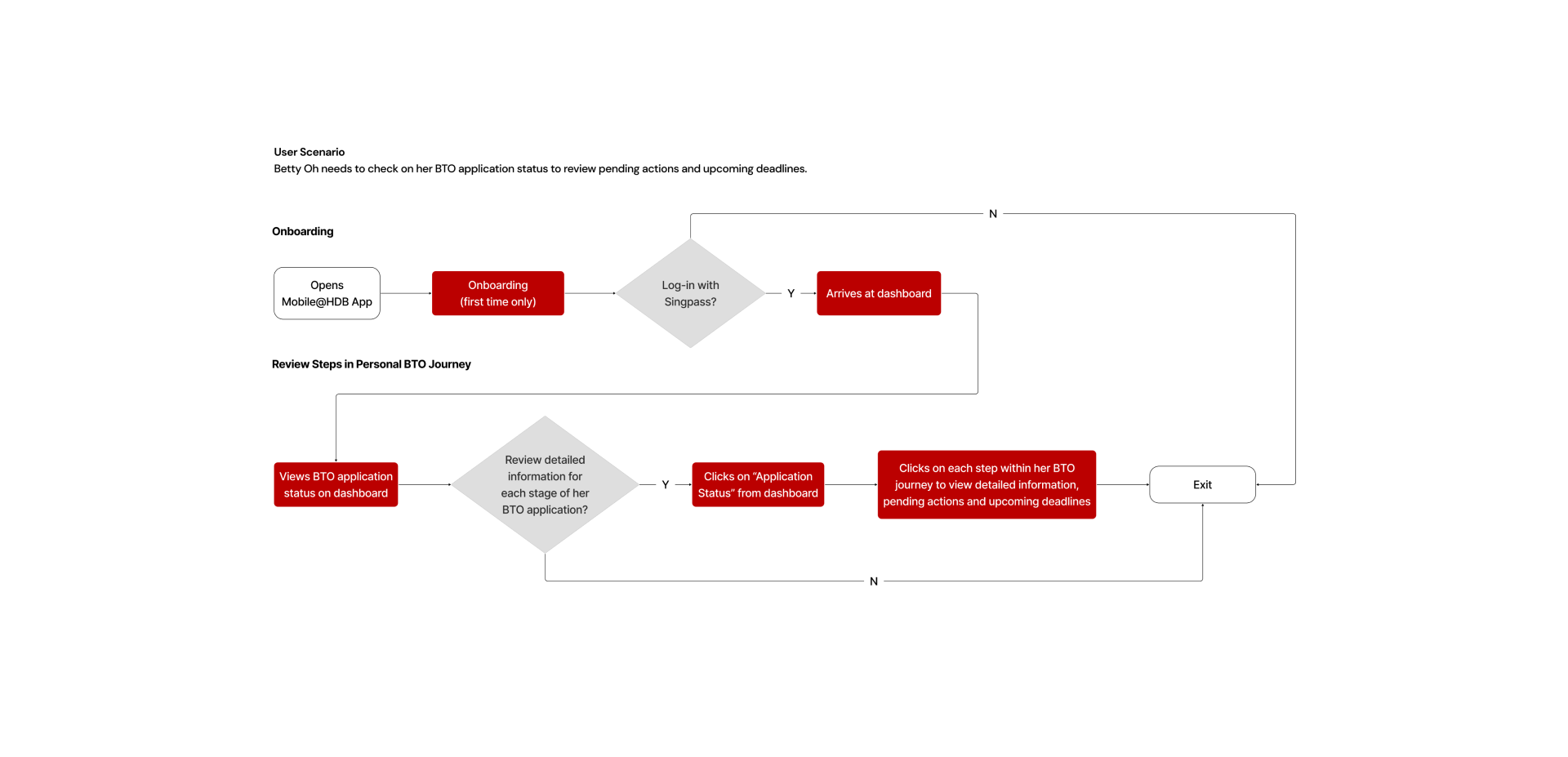
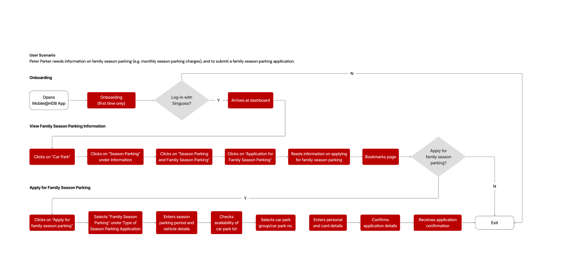
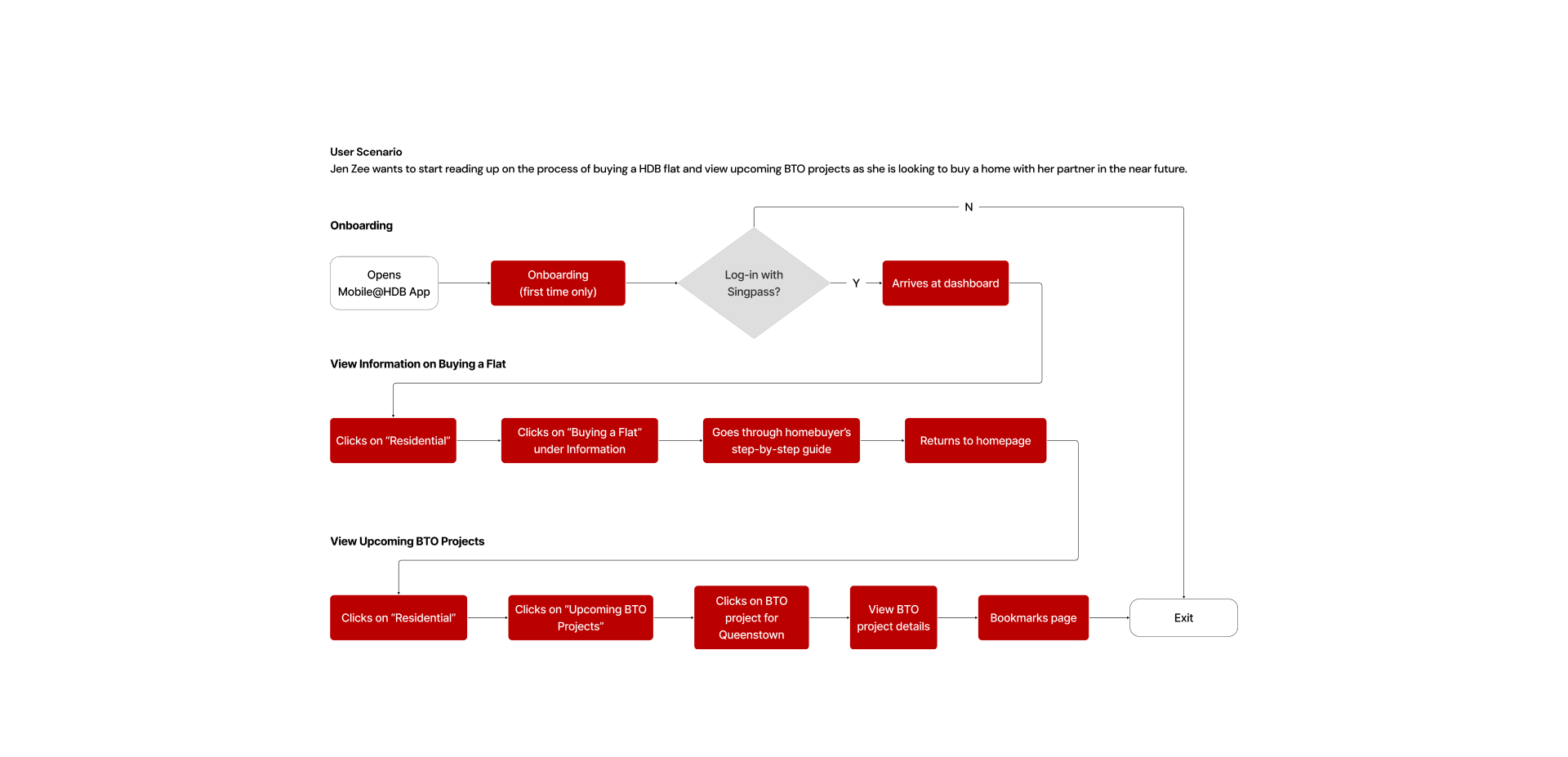
USER FLOWS
INFORMATION ARCHITECTURE
Tough because the content is extremely heavy. Put link to info achi
DESIGN SYSTEM
Typeface
Logo
Illustrations











Icons
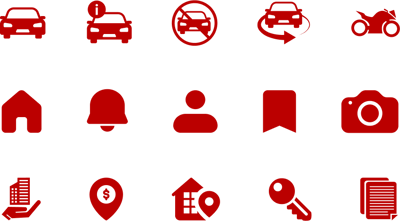
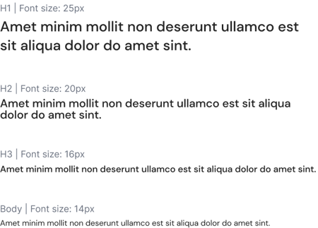
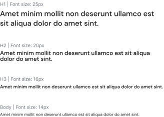
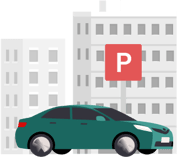
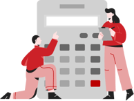
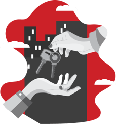
The initial design system was rather basic and lacked character. We introduced more icons and some vibrant illustrations at key touchpoints to make the interface more engaging. We also revamped the logo, transforming it from a plain text format into a sleek, elegant, and distinctive illustration.
Grid System
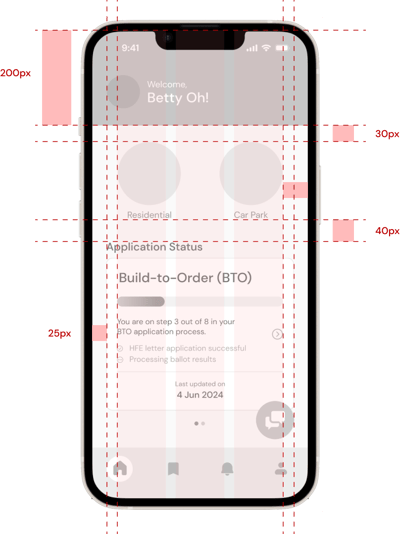
WIREFRAMES
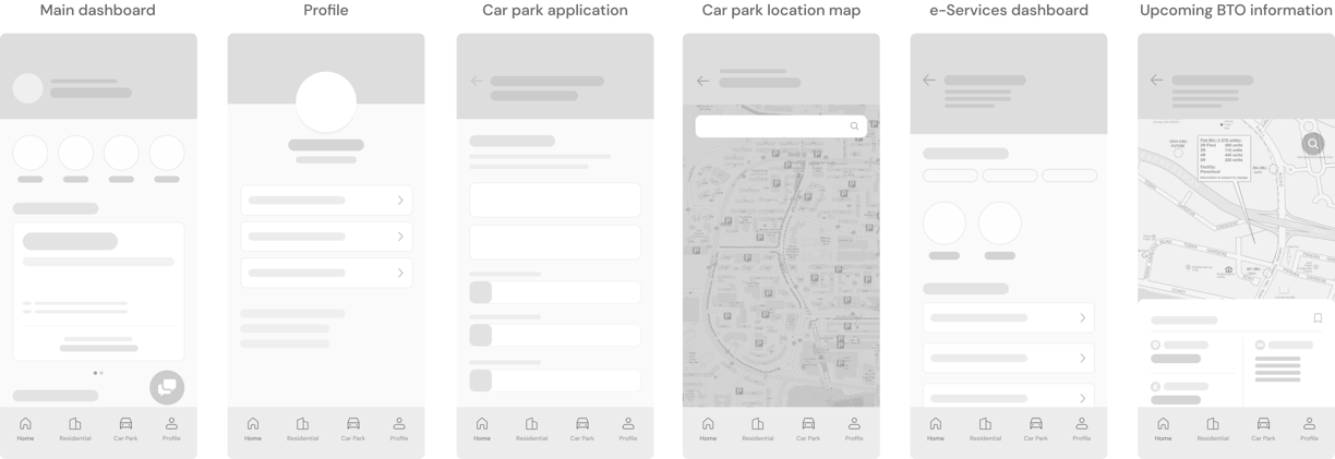
Wireframes enable you to outline the functionality of pages, identify issues early on, and reduce time spent on future revisions. It's far easier to modify a wireframe compared to a high-fidelity mockup filled with design elements. Revising a high-fidelity mockup requires significantly more time.
USABILITY TESTING
After finishing up our prototype, we gathered 12 participants to conduct usability testing. These users fit our persona groups and that includes those looking to purchase a BTO flat, season parking users and future home owners.


In the usability testing of the Mobile@HDB app, participants successfully completed the majority of tasks, achieving an average System Usability Scale (SUS) score of 82.7, indicating a high level of usability and user satisfaction. However, there were 3 instances where users did not complete the tasks given:
1. One user kept tapping on the onboarding screens instead of swiping.
2. A user missed seeing the balloting status card on the BTO journey.
3. Another user missed seeing the bookmark icon in the bottom navbar.
FURTHER RECOMMENDATIONS
Key usability testing findings identified several areas for enhancement, including ambiguous navigation elements and user confusion regarding interface cues, as detailed below. While there were additional areas for improvement, these issues were the most prevalent.
Navigation bar optimization
Users found that the bookmark and notification icon on the navigation bar was not as important to them, and would prefer to have icons that they would use more often.
Bookmarks page will be placed in the user profile, and the notifications will be on the main dashboard. The icons in the bottom navigation bar will be replaced with the “Residential” and “Car Park” icons.
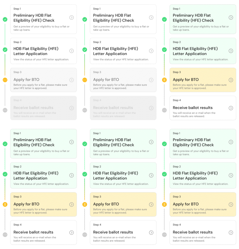
'Your BTO Journey' card colour update
Users were not aware that the greyed out cards in the BTO Journey were clickable, and thought that they were disabled due to the colour.
The card colours have been updated to improve user visualisation of their progress through the steps. Previously greyed-out cards have been replaced with white ones, to signal to users that they are able to click on the upcoming steps to view more details.


Presentation of vehicle details
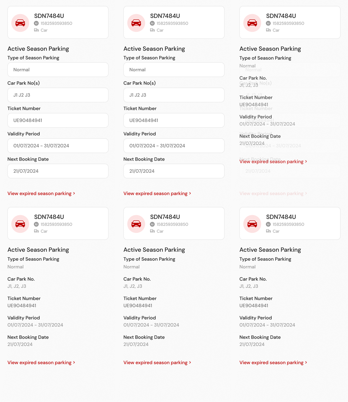
Regarding the vehicle details on the profile page, a user found it misleading that the text were in boxes as it gave the false impression that he could edit the fields for their current active season parking.
The boxes were removed and replaced with plain text to reduce the impression of the fields being editable.

FUTURE OPPORTUNITIES
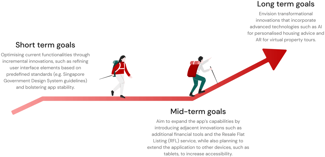
By adhering to the Innovation Continuum Framework, we are positioning the Mobile@HDB app to continuously adapt and respond to immediate user needs while also proactively anticipating and shaping future demands, ensuring its sustained relevance and utility in a dynamic digital environment.
The future development of the Mobile@HDB app will be strategically guided by the Innovation Continuum Framework, ensuring a structured approach to ongoing enhancements and the rollout of new features.
CONCLUSION
Collaboration breeds success
Creating impact and responsibility
Collaboration breeds success, as I discovered while working with a group of five on redesigning a government app. Despite our strong relationships as classmates, we faced natural differences in work styles. These challenges, while initially causing some friction, ultimately enriched our project by bringing diverse perspectives.
Through open communication and mutual respect, we navigated these differences, demonstrating how teamwork can lead to successful outcomes.
A governmental app instills a sense of contributing to public service and making a positive societal impact. It's crucial to recognize the responsibility involved, as the app will be used by a diverse audience and can significantly affect their daily lives.
Despite not being an official redesign, I was very happy to be part of this project. The experience was immensely rewarding, as it allowed me to apply my skills to a meaningful cause, work closely with my classmates, and navigate the complexities of real-world design challenges.


