Founded over a decade ago by May, Madam Milan has established itself as a household name for secondhand luxury goods in Singapore. Their mission is to empower women to feel beautiful with a curated selection of pre-loved designer bags, shoes, and accessories, at a fraction of the original price.
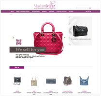
As the product designer for this project, I redesigned the Madam Milan's website to create a more elegant and enjoyable shopping experience for all users.
Madam Milan believes that the timeless style and trusted quality of designer goods should not have to cost a fortune.


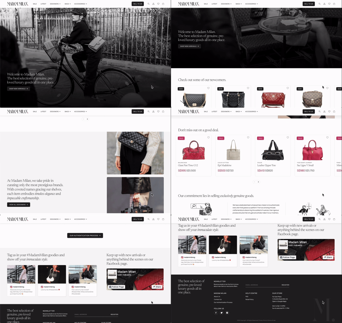

I redesigned the Madam Milan's website to ensuring users enjoy an exceptional experience, from their first visit to the website to checking out with their dream handbag. I will be focusing on:
GOAL
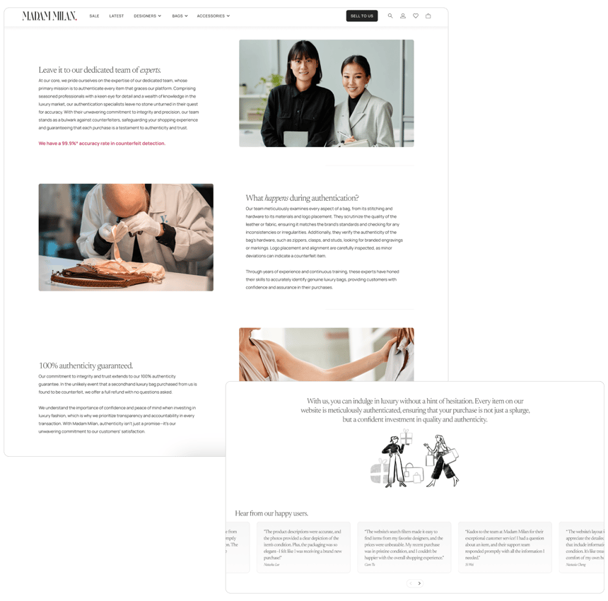
Creating a comprehensive authentication process page with past user testimonials and reviews, to build trust for potential customers.
Updating the interface design to be more modern and simple, to match Madam Milan's luxurious vibe.
Streamlining filter options to allow users to find what they need efficiently, resulting in a more pleasant browsing experience.


DESIGN PROCESS
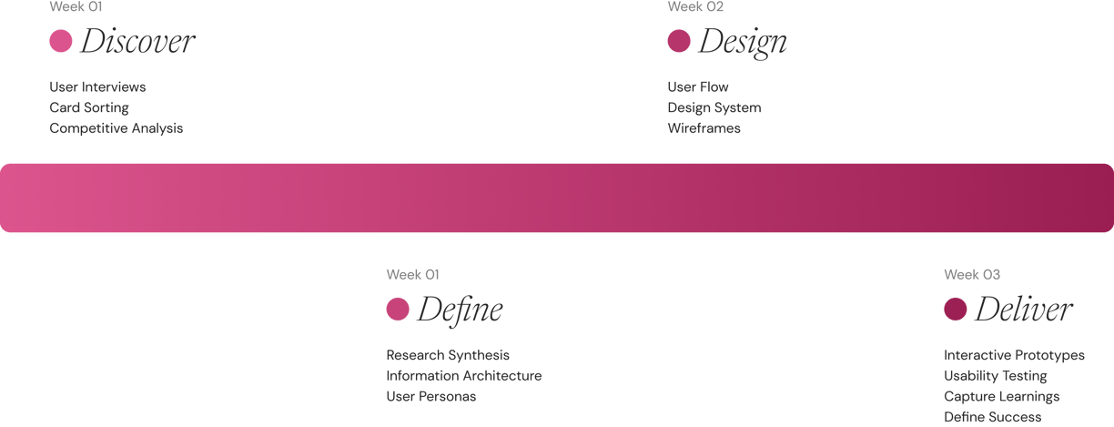

Following the double diamond design process, I engaged in the Discover phase to gather data from user research, card sorting and competitive analysis, then moved to the Define phase to gather key insights, identify themes and form user personas and user journeys. In the Design phase, I made changes to the design system, created wireframes and prototypes of different pages of the website. Finally, in the Deliver phase, I conducted usability testing, refined the best solutions into final designs, addressing user frustrations, delights, and enhancing the user experience.
This structured approach ensured comprehensive problem exploration and user-centered design solutions.
COMPETITOR ANALYSIS

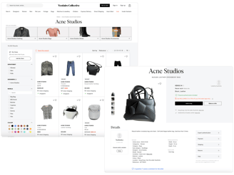
Vestiaire Collective
The UI design of Vestiaire Collective is clean and clear to navigate. The product pages are equipped with all details that a user would want to see when purchasing a secondhand item, such as the seller's location, item condition, measurements, and physical authentication status. Additionally, the direct enquiry option enhances trust between users and the seller and/or platform.
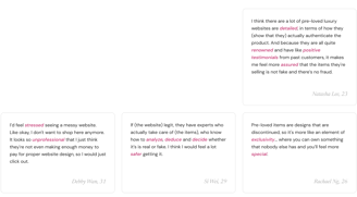
In the interviews I conducted, many users also cited Vestiaire Collective as a trusted platform.
Product pages
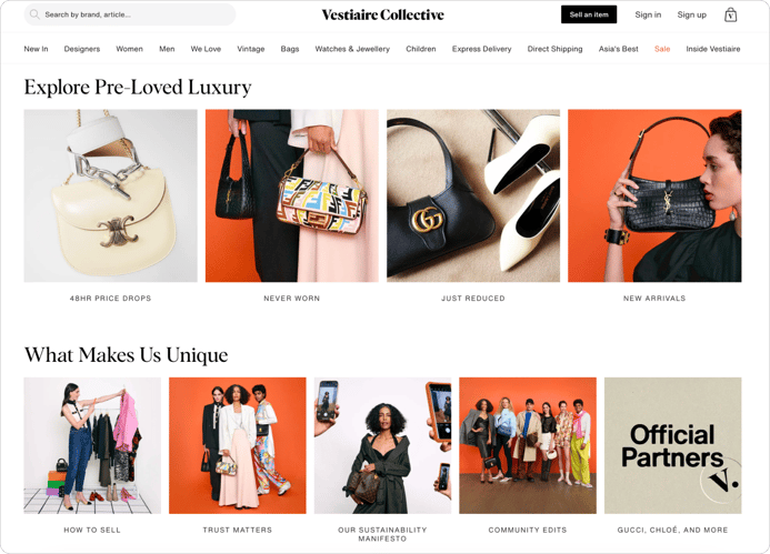
On the home page, various sections are designed to captivate users, such as brand-new items, newly reduced sale items, and new arrivals. These sections caters to users' desire to view latest trends and the best deals.
Vestiaire also differentiates itself from other secondhand e-commerce platforms by emphasizing its commitment to trust and authenticity. The "Trust Matters" section and the display of official partnerships with prestigious, trustworthy, luxury brands significantly enhance user trust. This approach addresses a common concern among users interested in purchasing secondhand luxury items, ensuring they feel confident and secure in their transactions.
Home page

Authentication process page
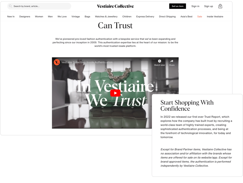
Vestiaire's comprehensive authentication page is a very significant and important part of their website because it explains in detail what happens during the authentication process. On this page, they provide an elaborate explanation of each step involved.
They are also very transparent in their copywriting, which helps greatly in establishing trust and confidence in users.
USER RESEARCH
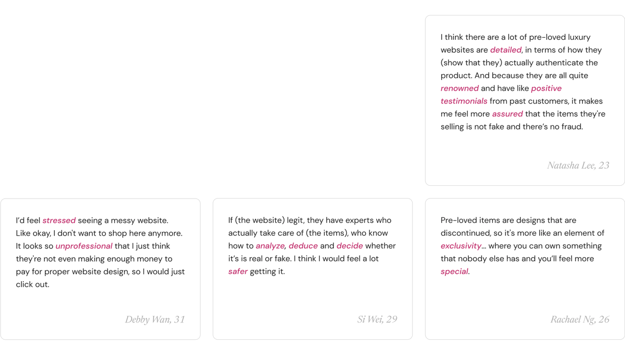
Some of my
users' thoughts
Key insights

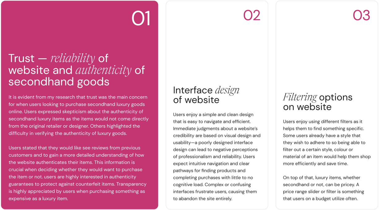
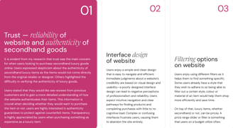
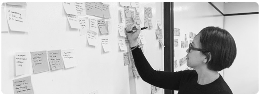
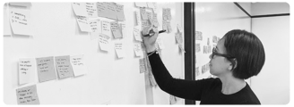
After completing my user interviews, I consolidated the data and conducted affinity mapping to identify patterns and common themes. This process revealed key user needs and pain points, which significantly informed the subsequent design stages.
USER PERSONAS
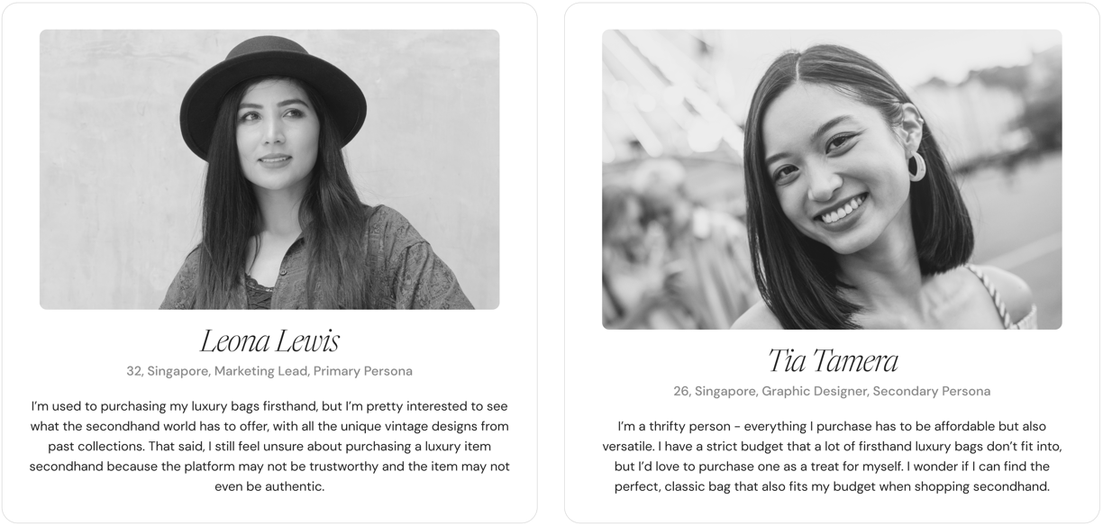

After identifying common themes, I segmented users into my primary and secondary personas. Leona, who represents my primary persona, represents the core needs of the majority of the users and Tia, my secondary persona, for a significant but smaller user group.
USER JOURNEYS
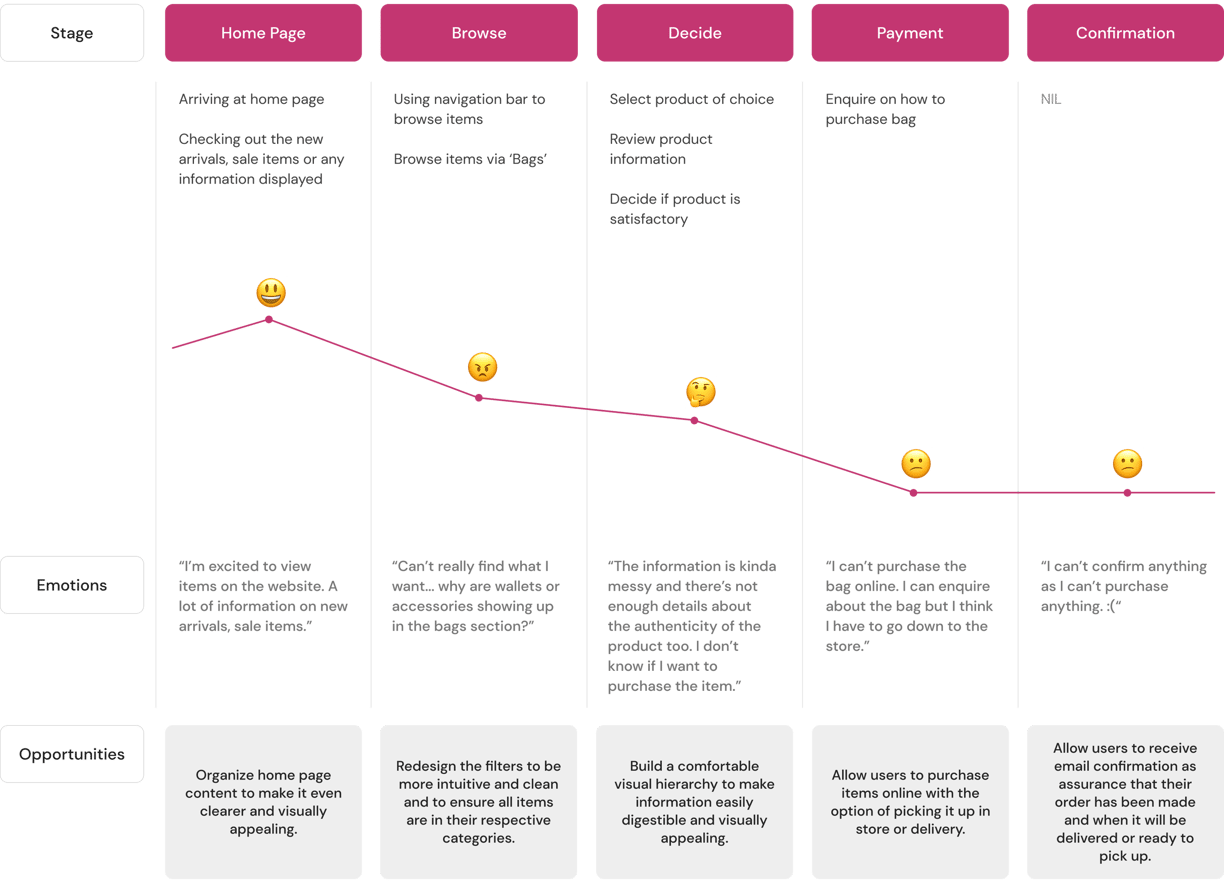
Despite having different goals and shopping styles, both personas have similar user journeys. They navigate through comparable steps such as browsing products, comparing options, and making purchases. While one may prioritize luxury and the other value and versatility, they encounter similar touchpoints and interactions. This similarity ensures that our design solutions effectively address the needs of both personas, providing a cohesive and user-friendly experience.
PROVIDING SOLUTIONS
Fostering trust and reliability
Creating a comprehensive authentication process page on Madam Milan can significantly alleviate users' trust issues. This page should provide detailed, yet easily digestible information about how Madam Milan authenticates its products. Including images and videos to show what happens behind the scenes can further enhance user understanding. Additionally, Madam Milan should implement an authenticity guarantee to reassure users in the rare event that an item is not genuine.
Based on my market analysis and user research, I have implemented several design solutions to better cater to users' needs in their online shopping experience.
Simplifying and modernizing the interface design
Streamlining filter options
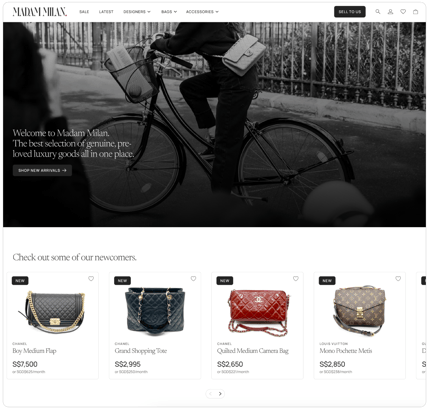
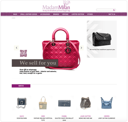
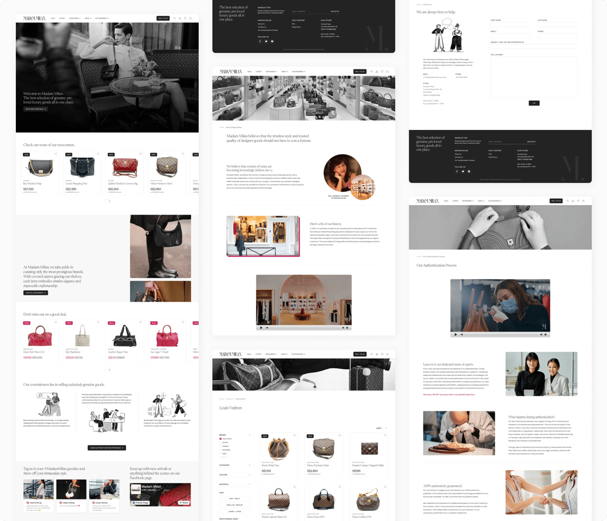
I refined Madam Milan's website by adopting a monochrome color scheme, eliminating the previous color palette to reduce visual clutter. A dark pink was introduced as the key accent color to add a touch of vibrancy and visual interest. To further streamline the design, I converted images to black and white, directing focus towards the product listings on the homepage. Additionally, I incorporated subtle animations in the hero banner and other sections, alongside elegant illustrations in key pages of the website to enhance user engagement and introduce an element of delight.
On top of this page, I will also refine the Frequently Asked Questions (FAQ) page and Contact Us page to provide users with more comprehensive support. The FAQ page will address common concerns related to product authenticity and the authentication process, offering clear and concise answers. The Contact Us page will be optimized to ensure users can easily reach out for further assistance, enhancing overall transparency and trust in Madam Milan's services.



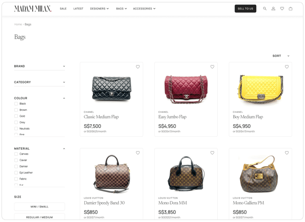


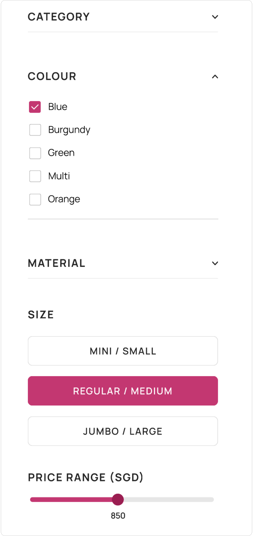
I optimized the filtering options for clarity and functionality by organizing them in an intuitive layout and making them easy to use. This comprehensive set of filters helps users with specific needs quickly narrow down their choices and find exactly what they’re looking for.
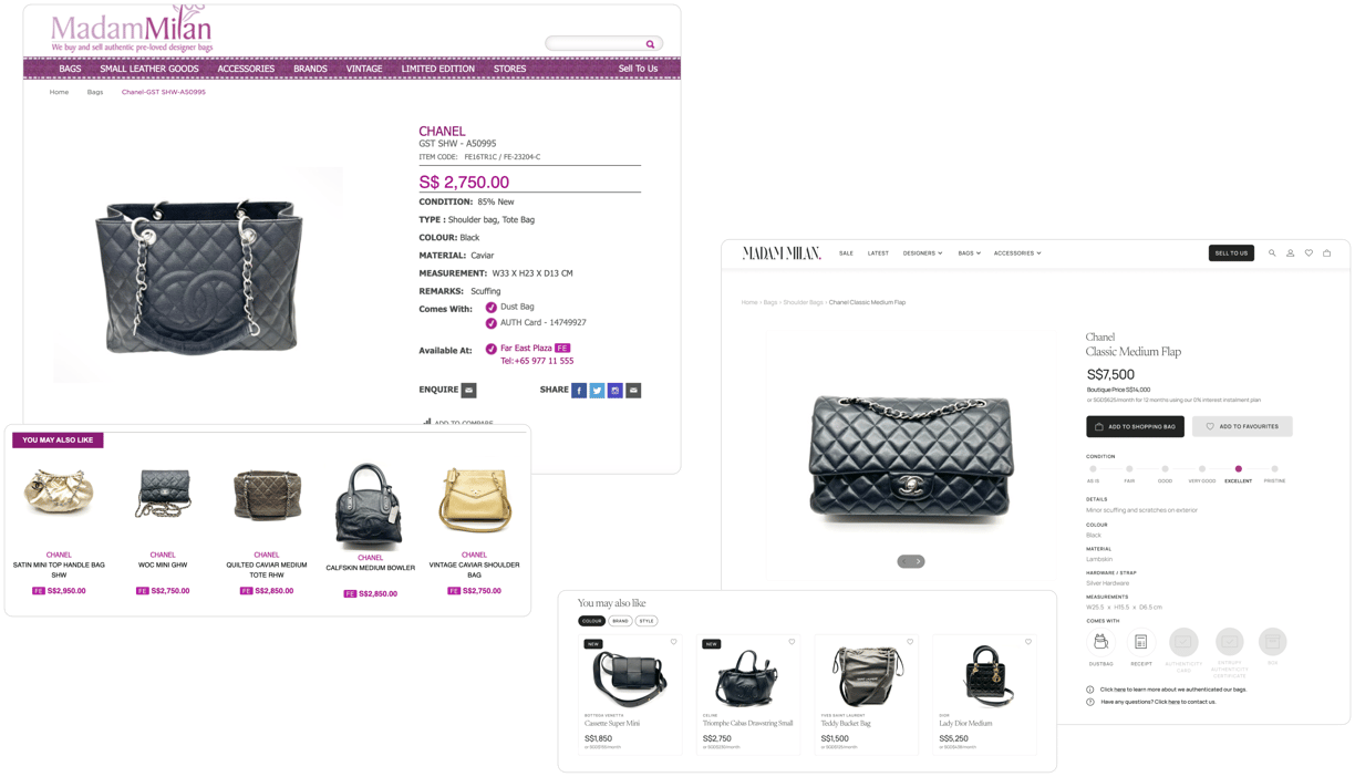
The product page is crucial for users' purchasing decisions. I ensured that all relevant details were presented, addressing users' needs for comprehensive information. I also included links to the authentication process page and the Contact Us page, allowing users to easily find answers or seek reassurance before purchasing.

CARD SORTING & INFORMATION ARCHITECTURE
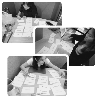

I conducted card sorting exercises with a few users to gain deeper insights into their mental models and how they categorize information. In these exercises, each user was presented with a set of cards, each representing a piece of information or a feature. The users were asked to group these cards into categories that made the most sense to them and to label each category. Through these sessions, I observed patterns in how users grouped similar items together, revealing their intuitive understanding and expectations.
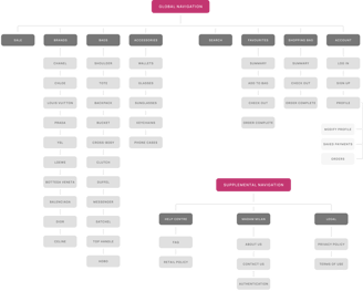
Analyzing the results from these card sorting exercises allowed me to design a more intuitive information architecture that aligns with users' natural inclinations. Below is the improved information architecture of Madam Milan.
DESIGN SYSTEM
Typeface
Colours


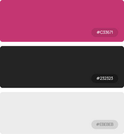
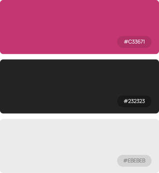
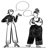
I refined the typeface and colour scheme to create a more elegant and sophisticated look, aligning with the luxury items Madam Milan offers. By using a sophisticated serif font for headlines and a clean sans-serif for body text, I achieved a balance between elegance and readability. The updated colour palette, along with a redesigned logo, high-resolution images, and minimalist illustrations, further enhances the website's luxurious aesthetic.
Logo
Illustrations




WIREFRAMES
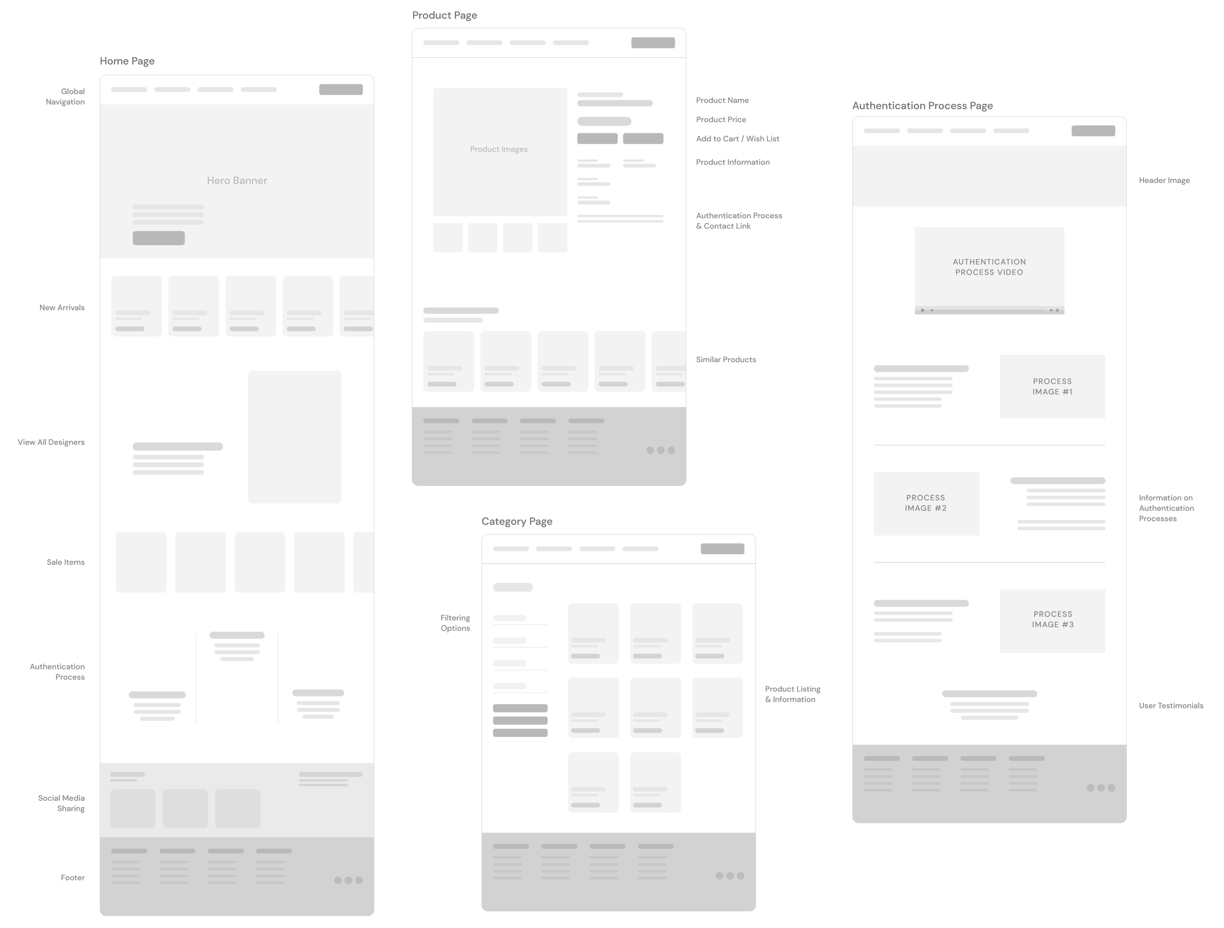
Creating wireframes enabled me to outline the functionality of pages, identify issues early on, and reduce time spent on future revisions. It's far easier to modify a wireframe compared to a high-fidelity mockup filled with design elements.
HI-FI SCREENS & PROTOTYPE
View my prototype of Madam Milan here!
USABILITY TESTING
After finishing up my hi-fi prototype, I gathered 5 users to conduct usability testing. This helps identify hidden issues within the design, validate design decisions, and improve overall user satisfaction. By observing real users, I can make informed adjustments to ensure the product is user-friendly and meets the needs of its audience. I designed five key tasks based on my earlier research that users typically perform when shopping on Madam Milan to assess their ease of completion.


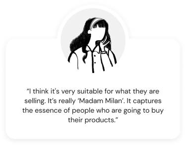
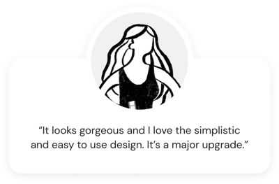
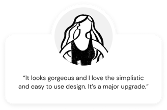
Feedback from users


REFLECTIONS
Confidence is essential
As Madam Milan was my first UX project, I initially felt nervous about potentially making mistakes. I soon realized that there are no rigid rules for every aspect of the process. Seeing that I was meeting my goals and achieving user satisfaction was incredibly rewarding. It made me feel accomplished, knowing I had made someone's online shopping experience more pleasant and efficient.
Importance of iterative design
Initially, I focused heavily on getting everything perfect in the first draft. Later I realized through usability testing and continuous user feedback, I learned that embracing an iterative approach—making small, incremental improvements based on real user insights—led to a more refined and user-centric final product. This process underscored the value of flexibility and adaptability in UX design, reinforcing that user needs and experiences should always guide design decisions.


